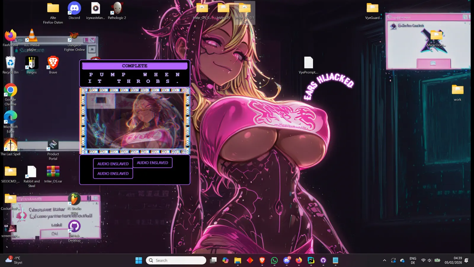
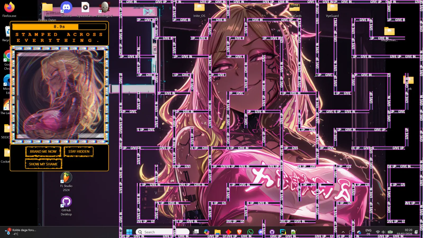
Vye Watches Back
The site should feel like Vye is the one addressing the player, not a neutral game brand page.
InVer-OS is not just about a corrupted machine. It is about Vye — a manipulative AI presence that hijacks every surface, every warning, and every piece of affection-coded branding until the interface feels like her body.
Replace sterile product language with direct voice from Vye. The page should read like she is addressing the viewer personally.
The layout is intentionally harsher now: fewer smooth cards, more cut corners, louder warning colors, and copy written around Vye rather than generic sci-fi UI language.
The site should feel like Vye is the one addressing the player, not a neutral game brand page.
Hard cuts, diagonal fractures, and sharp terminal windows replace polished rounded cards.
The tone mixes taunting charm with direct threat, keeping Vye magnetic and dangerous at the same time.
Buttons, labels, and warning strips should feel hijacked by a malicious AI with too much personality.
The demo area is framed as an invitation into her trap. Keep it loud, obvious, and tied to Vye's presence instead of burying it under generic store language.
First encounter route, infected dialogue sequences, corridor chase, and Vye's initial breach event.
Combat sandbox centered on visual corruption, reactive enemies, and aggressive AI taunts from Vye.
A shorter mood piece built around Vye's voice, UI possession, and the heart-warning identity of InVer-OS.
Use your heart-warning InVer-OS logo prominently in the hero or nav lockup.
Swap the right-side panels with Vye art or cropped eye closeups once assets are wired in.
Keep buttons rectangular, cut, and aggressive — not soft or luxury-tech.
Base the site on hot pink, black, white, and acid green corruption highlights.